How to Make an Affiliate Landing Page Which Convert
After bouncing around tech start-ups and university literature programs, Joe has finally settled down as Billo’s Head of Content. Joe now spends his days writing ads about ads, teaching clients how to craft killer content, and combing through our web copy with a bold red Sharpie.

Affiliate marketers’ success is not built on the association with any particular channel. However, creating landing pages for promotions is essential if you will create affiliates based on content. The objective would be to generate as many clicks to your call to action using high converting landing pages would give you a lot of control over that process.
Why Is the Quality of Visitors More Important Than Quantity?
Though having a lot of traffic and clicks to your call to action link, the number of visits translates to an actual sale. This is because the quality of the visits is a lot more important to affiliate marketers than the actual number of sales as it directly influences conversion rates and keeps visitors’ attention.
This necessitates a need for more intentional targeting to match the content on your free landing page and keep your visitor’s attention. Doing this would translate to greater success overall for all the affiliate marketers.
As much as the conversion of the visitors into actual paying customers is the ultimate objective, this process can be enhanced. As clients pay to use the high converting landing page, they expect to get as much value as possible.
A lot of the time, the customers could pay for the subscription the one time and not return.
The overall objective is to offer services that warrant conversion of leads into long-term paying customers instead of clients who pay for the cheapest plan and leave. High converting affiliate landing pages are the best option to enhance conversion.
This article will look at affiliate landing pages, their structure, and the steps that go into setting one up. It will also give tips on testing and tuning your landing pages to deliver the best results.
What Is the Definition of an Affiliate Landing Page

A landing page is a site created for the purpose of marketing. When carrying out a marketing campaign, landing pages will direct followers from the affiliate landing page to an external link to your site. You will create a target audience and funnel them to a desired standalone web page through affiliate marketing.
They differ from most web pages because affiliate landing pages serve a singular purpose, unlike most sites that perform multiple roles.
The Goal of an Affiliate Landing Page
The goal of affiliate landing pages is to nudge their visitors to perform a particular action as indicated by their CTA. These make them very useful for affiliate marketing companies and managers as they drive promising leads to your affiliate offers.
This typically involves visitors signing a form and offering up their email address, and in exchange, they get special offers to their visitors from affiliate marketing companies.
Can You Sell From a Landing Page?
No, the next stage would involve driving the traffic to a conversion funnel into a dedicated landing page, from where you can sell. This allows them to convince their leads to purchase products or services from a merchant. Typically a lot of the time, they may nudge the leads into signing up for a free trial and have them purchase in the future.
How Do I Create an Affiliate Landing Page?
You can use several intuitive tools to create a lander; two of the most popular are Landigi and Thrive.
However, the process can be quite complex; if you do not have experience in the field, we would recommend you hire someone.
Structure of an Optimized Affiliate Landing Page
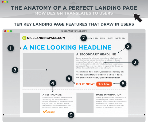
Your landing page should be designed to have the visitors interact with your CTA button.
This means the web page’s elements, including the design, the images used, the headlines, the benefit statement, and its CTA, should all be designed to funnel leads into conversions.

Design
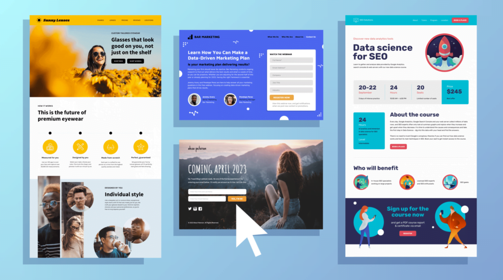
Design is the most noticeable element of any site. Whether your simple landing page is created using WordPress, an effective landing page builder, or a related plugin, making a visually appealing web page should be prioritized.
Given that most landing pages are created with a singular purpose in mind, it is best to have a clean site with a simple layout as it makes it easier to use. These affiliate pages are likely to increase conversions and earn money.
Highlight the CTA
The objective is to stay out of your visitor’s way by lowering impediments and distractions. Make sure your site design does not give your visitors a reason to abandon the site.
Use of Color
You can use color to highlight the most important bits of your online business.
Good color contrast can be used to highlight important bits of the site without being too intrusive to the experience. Using bright color and images make the site look that much more appealing.
Simplify Your Benefit Statement
A benefit statement should communicate the actual value of your services to your potential clients.
The success of your landing page does, unlike conventional thought, is not dependent on the features of the site but on the value it can deliver to the clients.
Communicate the Benefit of Joining
It should communicate concisely what your potential customers can get from hiring your firm. It outlines the benefits they can get from the platform’s promotional tools and networks available.
This information should be easily available to those looking to use our services on the front page of our site. You can offer more communication in the comments section of your affiliate platforms.
Have Information on How to Join
Make sure you insert information on how much they can earn after joining the affiliate program. They should also know what they should do to earn.
A lot of visitors expect to have affiliate information immediately availed to them. This information is used to make a careful judgment on whether or not to join the program or not.
Have More Information at the Bottom of the Site
If they need more specific information, they should have the affiliate information at the bottom of the page. You could also have a video that explains how the partnership works and how they are likely to benefit from the program.
You can use the Billo as a video Ad creation tool for its key features to create videos you can host on your site.
Make Your Copy Concise
The copy on your site should clearly communicate the benefits of the affiliate program.
It should aim to be as detailed as possible, and in doing so, it should target to answer commonly asked questions the visitors may have regarding the program.
Language Should Be Simple
As a rule of thumb, you should always ensure that you use concise language instead of needlessly complex language.
The key is always to make sure your users have an easy time dealing with your site.
Make Clear Arguments Backed by Data
It would help if you always made clear arguments on the value you could offer your visitors. This involves backing up your claims with solid numbers.
For example, if you promise an increase in trafficking, you should have the evidence to back up your claims. The evidence should be verifiable to enhance goodwill.
Your copy should not necessarily have storytelling in your website; you should, however, try and communicate to your visitors to alleviate any doubts they might have.
Highlight Your CTA
Depending on how much content is on your affiliate landing page, you should have your CTA appear multiple times.
You should have your CTA at the top of the page just after your benefit statement. But it should also appear somewhere in the middle of the page and once at the bottom of the page.
Always Makes Sure the CTA Is Readable
This allows your readers to click and interact with your CTA at any point when using your website.
Conversion can occur at any point of the website, depending on the visitors to the website.
Make sure the CTA is visible on your landing page. Make sure the visitor does not have to look for it or will likely abandon the website.
You can highlight them by having them in different colors to contrast that with the background.
You should also be persuasive with commands such as try for free, join, click here to learn more, get started, etc.
Demonstrate Your Social Proof
Social proof acts as a signal to push the visitors into a conversation. This could be a review, a case, or even something from social media. Social proof should include the person’s name, the company they represent, the person’s title, and a photo to enhance its credibility.
Use Video Testimonials
They have become more popular with the rise of the internet and digital marketing. These appear less scripted and add greater credibility to the proof.
This is better if the videos feature endorsements that are given in detail.
A well-known individual in the industry can also give it more weight for video testimonials.
What Is the Best Landing Page for Affiliate Marketing?
Having an affiliate landing page is a good start. The next step is maximizing the number of visitors that interact with your CTA button. Here are some tips on how you can get better results on your affiliate landing page. A good affiliate landing page should keep the following in mind:

Learn About Your Visitors
After creating your very own affiliate landing page and having generated some traffic, you should make sure you keep an eye on the search queries people use to find your page. This allows you to collect data that is useful for the future.
You can see these on your Google Search Console. This helps you know what your visitor’s intents are. Learn about the visitor’s pain points; this helps many affiliates create a lead magnet to help them solve the problem.
This can help you better your affiliate landing page by modeling it directly to the needs of your visitors. It will directly impact the amount of interaction you will see on your CTA.
Optimize the Affiliate Landing Page
Speed is one of the most important factors for Google search, Google Ads and Google. You should check how long it takes your page to load using Google Page Speed Insights.
Your website should not take longer than 3.5 seconds to load up your page for the visitor to access, click and scroll the page. This is best known as average document interactive time.
How to Check How Fast the Website Loads
You can check how fast your page loads on Google Analytics by choosing the Behavior option, then proceed to the Site Speed, then the Page Timings, and then open the DOM Timing tab.
Many speed issues can be solved by culling unoptimized images, fixing any missing files, ensuring all the plugins are compatible, and URL redirects.
Make Sure Mobile Is Optimized
This is more than worthwhile even when your mobile traffic share is not as small as other avenues.
Since Google introduced mobile-first indexing, Google bots can now crawl and index the mobile versions of every webpage.
This has made mobile websites that much more relevant to the internet. You check how your affiliate landing page works on mobile by running the Mobile-Friendly test by Google.
Do Not Include Too Many Navigation Links
You should avoid adding more links to your landing page. An affiliate landing page serves a singular purpose to nudge the visitors to conversion.
Having multiple external links undermines the purpose of the landing page.
Since the objective is not to give the visitors a reason to leave the website, you should only have a CTA affiliate link avoiding all others.
Make Sure You Test Your Landing Page
You should attempt split testing or A/B testing to gauge how fast your landing page is.
Using A/B and Split Testing
The most direct way of testing out your page involves splitting the page by two. Have half your visitors use one version of the page, page A, and have the other half use the other half, version B.
You can test out the site elements like CTA, benefit statement, copy, headlines, images, and even layout.
Using Google Optimize
There are various tools you can use to test out your website. Google Optimize is a free and effective tool that gives you full access to optimize your website through rigorous testing.
With Google Optimize, you can choose to create different variations of the same website and test them against each other.
Using CMS Different Platforms
Alternatively, you can run your website on WordPress or alternative CMS platforms you are using. You can then create another version with some changes, be they a different CTA or benefit statement.
Afterward, you can use google analytics for a specified time to monitor people’s interaction with all versions of the affiliate landing page.
Conclusion
Following the tips laid out above, you can easily create a high converting affiliate landing page that attracts visitors.
You can also optimize those same affiliate landing pages by using better design, headlines, social proof, and CTA. These will yield greater effectiveness for your website.
With the skills outlined, you can deliver better user experiences to visitors to your websites by modeling them through their needs and intent. You will be able to fulfill visitors’ expectations, translating to a successful affiliate landing page.
Continue learning:
Head of Content
After bouncing around tech start-ups and university literature programs, Joe has finally settled down as Billo’s Head of Content. Joe now spends his days writing ads about ads, teaching clients how to craft killer content, and combing through our web copy with a bold red Sharpie.

Authentic creator videos, powered by real performance data
22,000+ brands use Billo to turn UGC into high-ROAS video ads.
When to Trust Data-Driven Suggestions (and Whe...
Platforms, dashboards, and AI tools now shape nearly every marketing [...]...
Read full articleThe Power of Content Seeding: How to Plant Your ...
Content distribution has shifted — dramatically. Today, 70% of B2B [...]...
Read full article10 Common Digital Marketing Mistakes to Avoid in...
Digital marketing is fast, and what worked years ago might [...]...
Read full article


